THE CHALLENGE
By late 2020, Myntra’s internal Customer Verbatim Analysis revealed a growing paradox: our high-end fashion photography was “too good.” While visually stunning, it was creating a disconnect between the digital screen and the physical product.
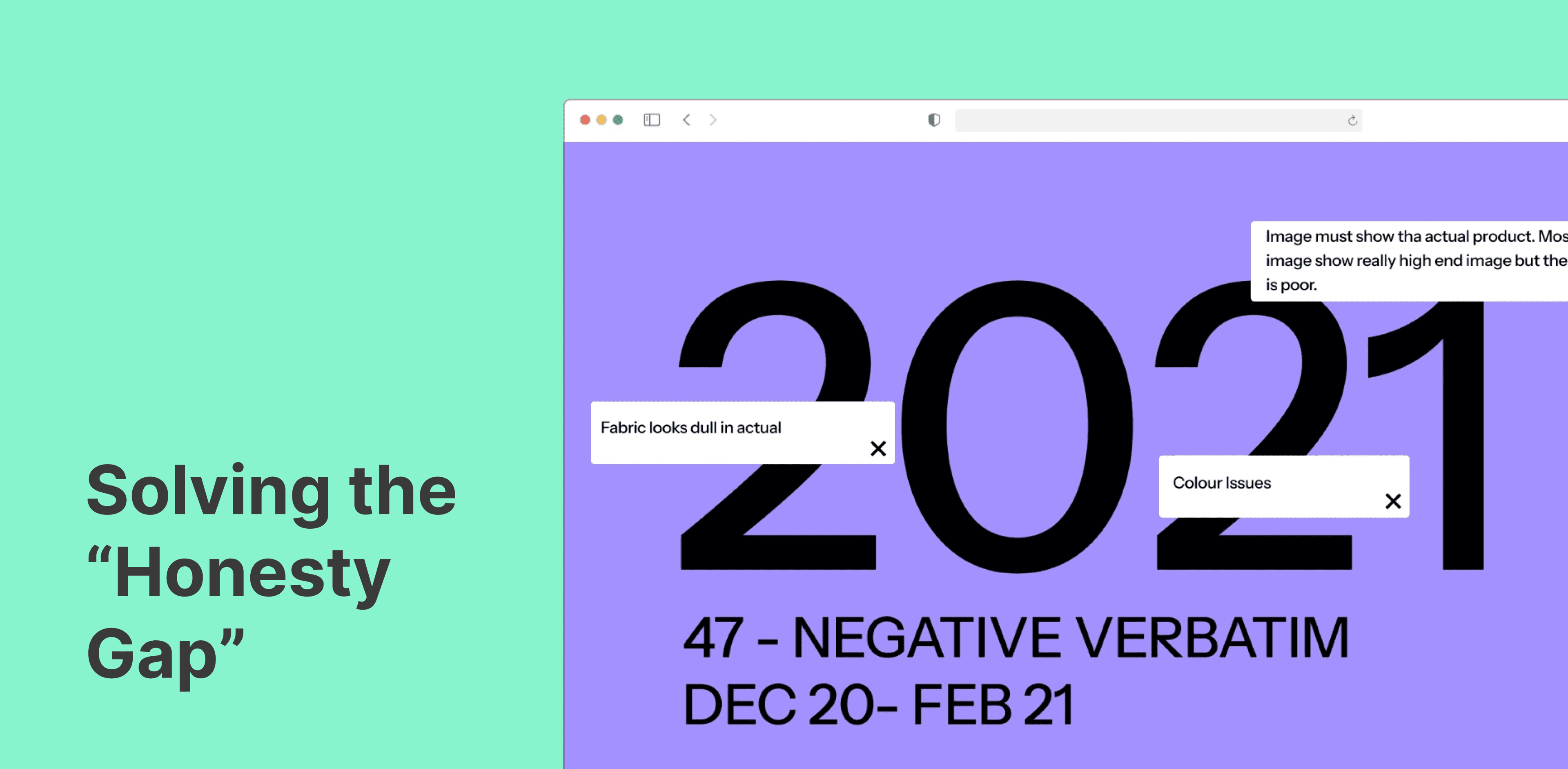
- The Data Audit: Analyzed 47 negative verbatims (Dec 2020 – Feb 2021) specifically targeting imagery.
- The Core Problem: 39% of dissatisfied users cited “Image too appealing,” meaning the product they received didn’t match the over-glamorized studio shots.
- The Secondary Friction: 20% of users reported color discrepancies, and 22% felt the quality (fabric/texture) was not as expected.

THE DISCOVERY
Identifying the "Friction Bubbles"
Using a sentiment-mapping approach (see bubble chart), I identified that “Product color looks different” and “Fabric looks dull in actual” were the primary drivers of negative sentiment.
The existing solution—primitive, raw CAD sketches—was safe but lacked the “aspirational” quality needed for the festive and pujo categories. We needed a middle ground: a visual format that was high-fidelity enough to inspire, but technical enough to be honest.

THE DESIGN INTERVENTION
The Enriched CAD System
I led the redesign of the Myntra Fashion Boutique (Phase 1) catalog assets to directly address these NPS pain points.
- Tactile Accuracy vs. Studio Lighting: Instead of unpredictable photography, we developed 10 standardized CAD templates per category (Festive, Pujo, Party). These utilized specific Photoshop actions to mimic real-world fabric grain and stitching details.
- Addressing the “Color Gap”: By using standardized hex-coded textures in our CADs, we tackled the 59% of color-correction issues identified in the NPS data.
- Personification (The “Rangrez” & “Soni Kudi” Models): We integrated creative copy and personified titles into the artboards to give the technical drawings a “boutique” feel, replacing the “primitive” look with a professional, curated experience.

TECHNICAL INNOVATION
Scalability through Python
With 92 styles to launch and a goal of 150+ styles per batch, manual design was the “cumbersome bottleneck.”
- The Collaboration: I partnered with the engineering team (@Srivathsa C N & @G P Sasikumar) to translate my design layers into a Python-based automation code.
- The Efficiency Win: We reduced the design-to-catalog time from 3 hours to ~11 minutes per 150 styles.
- The Result: This allowed us to maintain high-fidelity visual standards across a massive volume of styles without human error or color inconsistency.

IMPACT & VALIDATION
The intervention led to a measurable shift in customer sentiment and operational health:
- 94% Decrease in Negative Verbatims: Comparing Feb 2021 to Oct 2020, the shift toward standardized, honest CADs drastically reduced “Image too appealing” complaints.
- Zero-Error Scalability: The Python-led automation ensured that every single one of the 92 live styles met the exact same color and texture parameters.
- Catalog Transformation: The “Boutique” experience successfully bridged the gap between a raw sketch and a finished product, creating a more reliable “Campaign-to-Conversion” path.

KEY LEARNINGS
- Aesthetics vs. Accuracy: A product designer’s job isn’t to make the “prettiest” image, but the most accurate one.
- Data as a Design Compass: The NPS bubble chart wasn’t just a report; it was the roadmap for our Photoshop actions and texture choices.
- Automated Integrity: Automation doesn’t just save time; it ensures consistency, which is the foundation of customer trust in a catalog.