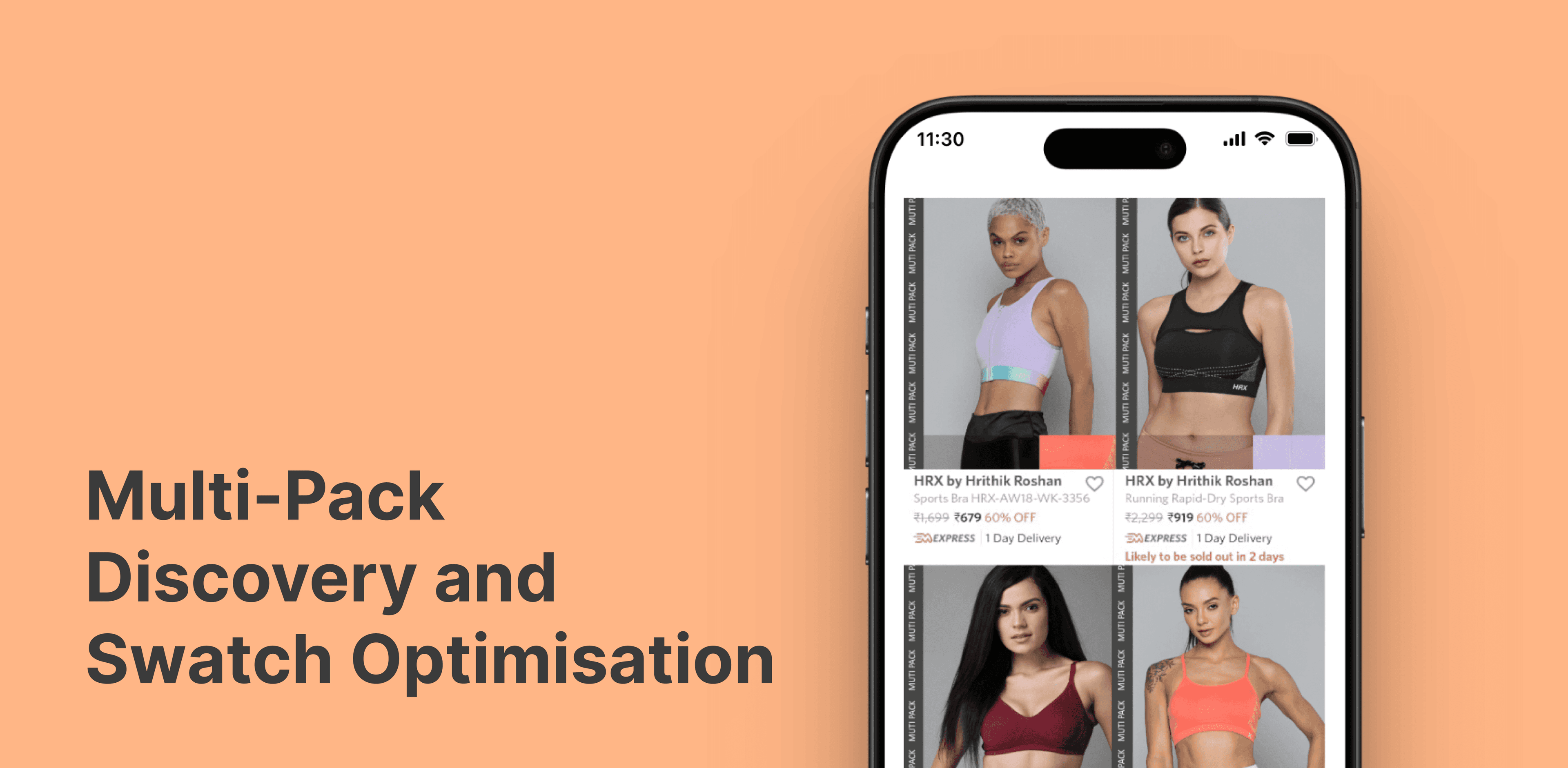
THE CHALLENGE
In the current e-commerce experience, multipack products (bundles) were suffering from poor discovery. The “Current” design relied on small, disconnected swatches and text labels that failed to immediately communicate the value and variety of a bundle.
THE PROBLEM STATEMENT
- Poor Multipack Communication: The “Multipack” status was often missed by users, leading to price-shock (perceiving the price as high for a single item) or missed value perception.
- Visual Friction (Swatch Placement): The existing swatches appeared as floating overlays, often looking like “editing errors” or UI glitches that obscured the product image rather than enhancing it.

OBJECTIVES
- Improve Product Discovery: Make the “Multipack” value proposition undeniable at first glance.
- Catalog Redesign: Create a premium, intentional layout for swatches that feels integrated into the brand aesthetic.
THE PROPOSED SOLUTION
Solution 1
Structural Branding (The Vertical Sidebar)
Instead of a floating tag, we introduced a “MULTI PACK” vertical ribbon. Why: It creates a “Product Frame” effect. By placing it on the edge of the image, it signals a different category of product without covering the model’s face or the garment’s texture.
Solution 2
Integrated Swatch Gallery
The swatches were moved from the bottom-left “dead zone” to a dedicated preview window within the primary image. Why: In the “Proposed” design for women’s bras, the swatch isn’t just a color dot; it’s a preview of the actual secondary items in the pack. This eliminates the need for the user to click through to see what else is in the box.
Solution 3
Layout Hierarchy (Grid Optimization)
For high-variety packs, we moved toward a quad-split or dual-split thumbnail approach. Why: This allows the user to see the fit on different models or see all colors in the pack simultaneously. It transforms the listing from a “Single Product” view into a “Collection” view.
